Lioness Home Origins

My Pride at the St. Anthony Sand Dunes 2010
My “Pride” in 2010 at the St. Anthony Sand Dunes

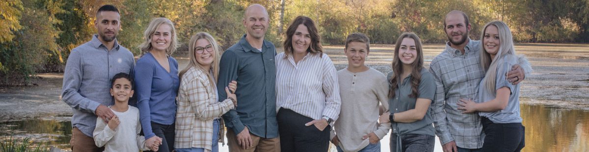
Nine years ago I was a mother of five young children ages 12, 11, 8, 4, and 2. Some days I felt like I was swimming (or drowning) in the sea of insanity, so anytime I had the opportunity to be with grownups and talk about big girl things it was a good day. On one such occasion a few friends invited me to attend the April 2010 Women’s Conference at BYU in Provo, UT. You can imagine my excitement when I realized that the closing speaker was going to be one of my favorite speakers and role models, president of the General Relief Society of the Church of Jesus Christ of Latter-Day Saints, Sister Julie B. Beck. It had been a weekend full of great speakers, ideas, laughing and friendship. I had gotten good ideas and skills for personal growth and felt rejuvenated to go home, implement and start swimming again. With pen in hand, I set myself to be taught in this final inspirational moment. Something powerful ignited inside of me and I knew I would never be the same when she said these words:

“I have said lately that women are like lionesses at the gate of the home. Whatever happens in that home and family happens because she cares about it and it matters to her. She guards that gate, and things matter to that family if they matter to her. For example, if the lioness at the gate believes in the law of tithing, tithing will be paid in that family. If that family has a humble little portion of ten pesos coming in, that lioness will safeguard the one peso if tithing is important to her. If that lioness at the gate knows about renewing her baptismal covenants with God, she will be in sacrament meeting on Sunday, and she will prepare her children to be there. They will be washed, cleaned, combed, and taught about that meeting and what happens there. It isn’t a casual event, but it is serious to her, and it will be serious to them. The lioness at the gate ensures that temple worship is taken care of in the family. She encourages that participation. She cares about seeking after her ancestors. If the lioness at the gate knows about and understands missions, missionaries, and the mission of the house of Israel, she will prepare future missionaries to go out from that home. It is very difficult to get a lion cub away from a lioness who doesn’t believe in missions, but if the lioness believes in a mission, she will devote her life to preparing the cub to go out and serve the Lord. That’s how important she is. Service happens if she cares about it. Sisters, you are each like the lioness at the gate. This means that there has to be some prioritizing. I was taught years ago that when our priorities are out of order, we lose power. If we need power and influence to carry out our mission, then our priorities have to be straight.”

Bam, Pow, Bang, and just like that my future “womaning” from that moment on was figuratively cast into an iron-clad lioness mold. The future was clear and I knew that all of the efforts I had been giving and would need to give would be worth the eternal investment. Home and family are a BIG deal and it was time for me to rise up, do my duty, and be intentionally BOLD about doing it!

Parker Family December 2018
My “Pride” in 2018 on Texas Christmas Vacation

The last 9 years definitely haven’t always been easy. In fact, many days have been downright overwhelming and discouraging, but with my lioness-fighting heart I haven’t given up this fight I started 9 years ago. You see, I have come to understand that being perfect at trying to do all of the good things above and exercising faith in Jesus Christ and not outcomes is what keeps me and my family (immediate and extended) prospering in the land. That is how we can keep power and priorities straight.

Will you come and roar with me?

Love,
The Lioness
a.k.a. Jodi

Lioness-Logo-with-text

Deliberate Self-Help Mothering + Book Reviews

It’s a good word: deliberate. I really like what it makes me feel like when I say it. It makes me feel planned, dependable, organized, ready, proactive, and motivated. When I use this as the adjective before mothering it is a bit overwhelming too! But I still like it nonetheless. Something I love to do for a past time is read a lot of self-help books. I’ve decided that the reason I like it so much is because I take my job as a mother very seriously and I’m always looking for ways to perfect it. Since circumstances and needs of 5 children are ever changing, I’m sure that it is a quest and need that will never go away. I love being a mom, but it is stinking hard. HARD! I didn’t know it would be such a challenge when I signed onto the job as a new mom at age 21; but if it wasn’t such a challenge I’m certain the joy and rewards, when they come, wouldn’t feel as amazing! I’ve learned through the course of my study and planning that parenting/mothering is not for wimps. I have to be strong and not care when my child says, “I hate you” or glares at me then rolls her eyes. I can’t take it personal when the tantrums, pouting, and sulking pour out abundantly, nor be humiliated and embarrassed when mistakes happen in public and both of us forget the things we know we should do. I just have to say that what I do know for sure is that I am an imperfect mother who loves her imperfect children. The family quest is to be our best selves (whatever it is for the given day). This sure is a healthy approach and I will need to refer back to this paragraph when the pressure is turned on again and emotions are flaring. 🙂

As stated above, I have sort of an obsession with self-help kinds of books. Again as I think about this, I’m always trying to look for ways to make what I do everyday better. I also like to have fresh and new ideas to try and see what possibilities are out there. I also enjoy learning and seeing things from many different perspectives. So I would like to take a second and give a shout out to some great books that I’ve gleaned ideas from through the past years.

scriptures.jpg

#1 – First off the bat, I cannot stress enough the importance it has been for me to read the scriptures! When I read from the scriptures I am inspired by the kinds of parents found in there. The amount of faith needed many years ago is probably the same amount of faith that I need now to teach my children the ways of God. Through reading the scriptures I understand my own nothingness and the need for acknowledging that these children in my home are actually God’s children – that they are on loan to me here on earth. With this in mind it becomes paramount that I use the life-line that prayer can be in giving me the inspiration needed to reach the spirits that have come to live in my home. If I can keep focused on where we all came from and what our purpose and goal is in being here, I will be able to be like the parents I read about in the scriptures. Right now my favorite advice given in the Book of Mormon is from Lehi. It is found in 1 Nephi 8:37-38, it is a great couple of verses, but the last line says it all for ME personally, “and he did cease speaking to them.” LOVE this advice. Sometimes I just need to trust my kids after I’ve said & done all I can, then let them decide for themselves.

#2, #3, #4 – Three books from Richard and Linda Eyre: The Entitlement Trap, Teaching your Children Values, and How to talk to your child about sexThe Entitlement Trap came at a time in my life when I needed to learn about teaching and expecting ownership in my children – ownership is the remedy to entitlement. I needed to know that when they make mistakes it is good and ok for them to own up to them and I don’t have to take them on and feel the guilt from them. I also learned that ownership is linked to many different life experiences, such as: our health, money, testimonies, relationships, etc… The book, Teaching your Children Values gives parents the idea of focusing on specific values each month for a year. Honesty is the first value and we learned that honesty is the foundation of all other principles. I LOVED teaching this and focusing on it and now we are building. This month we are teaching about peace-ability – something that our home could greatly benefit from. I typed & printed off the suggested monthly word and magnetized it to our fridge where it can be stared at every time we eat as a reminder. How to Teach your Child about Sex – a super uncomfortable and awkward subject before reading the book and a less super uncomfortable and awkward subject afterward. It gives great dialoguing and suggestions to teach appropriate ways to explain where babies come from.  It treats the subject as “the most wonderful beautiful and awesome thing in the world” – I think that is cool. If you think about it, it really shouldn’t be embarrassing, we need to be the ones to teach this NOT the radio, TV/movies, friends, school, or internet. I want my kids to know they can talk to Stephen and I about this and that we treat this subject as respectful, special, wonderful, and sacred.

#5 – The Child Whisperer – by, Carol Tuttle. This book has really given me a new way to look at all people not just my children. Carol Tuttle teaches that we all are born with a “nature” something we generally call our personality and that our nature and facial/body features are connected. She has broken it down into four “types” – very much like the color-code book (think red, blue, white, & yellow) but on a much deeper level. I really appreciated reading this book! It helps me be much more patient and understanding as a parent. It helps give me ideas of ways to connect with the different needs/natures of my children and reasons to why they behave and act certain ways. It also empowers me with what I can do to support them in living true to who they are. I also learned a lot about myself and am more gentle, accepting, and content with my own “Type 4/1” nature. I don’t feel such a need to try to be like “so and so”, but just focus on being my best self. If we were all the same it would be a boring world. I like how this book teaches us to appreciate the wonderful attributes that others have to offer and be ok with ourselves.

#6 – The Parenting Breakthrough, by Merrilee Browne Boyak. I LOVE this book – it is my most recent read. It gives the reader great ideas on why its important to have kids work! She explains that when kids learn how to work, and provide for themselves and acquire other necessary life skills they need to know before they are 18 and leave our homes,  that they will have more confidence and better self-respect and esteem.  She has a comical way of taking the reader through the book so it is light hearted, yet important. She comes across as a REAL mother, even though she clearly has it all together. Favorite things from this book are the idea of creating a family time line, not being afraid to have tough love and expect kids to work, and teaching skills that will in turn give our children the confidence they need to navigate life when they leave the comforts of our home and need to be independent. I highly recommend that ALL parents read this book.

Act with FAITH; don’t react with FEAR

easter familyAct with faith; don’t react with fear. When our teenagers begin testing family values, parents need to go to the Lord for guidance on the specific needs of each family member. This is the time for added love and support and to reinforce your teachings on how to make choices. It is frightening to allow our children to learn from the mistakes they may make, but their willingness to choose the Lord’s way and family values is greater when the choice come from within than when we attempt to force those values upon them. The Lord’s way of love and acceptance is better than Satan’s way of force and coercion, especially in rearing teenagers.”

Elder Robert D. Hales, Ensign, May 1999

Project 9: Portfolio

[scribd id=260787056 key=key-lz1NcPqnNdub3i8jnfHC mode=book]

Project Corrections / Time Spent: I spent an hour and a half designing a new layout for a Resume. I found that it was important to choose a color scheme that was bright and contrasted with the white font. Using Adobe Photoshop to delete the background off of simple images of an envelope, map pin, and telephone helped me be able to get images that would work into my design; turning it into a vector graphic in Illustrator was the final touch.  Deciding to make corrections on my Event Ad, I spent well up to one hour improving the proximity and alignment of my text and gradient lines. The corrections gave me an opportunity to perfect my Ad and possibly use it as a template for future design needs as I am a volunteer for this organization.

Message: There will be a time in the future that I will need and want to showcase my work in a professional way.  Using a bold, structured, and clean design I was able to highlight my designs while displaying my personality.

Audience: Potential client and employers.

Top Thing Learned: Using the FOCUS principles and having a basic understanding of the Adobe Suite Software, even a novice can produce impressive designs.

Future application of Visual Media: I plan on using these skills to communicate positive messages whenever and wherever required of me.

Color scheme and color names: Complementary, Teal & Brick

Title Font Name & Category: Oswald – Sans Serif

Copy Font Name & Category: Garamond – Serif

Thumbnails of Images used:

Lioness_Communication_whitewhite envelopewhite map pinwhite phone icon

Project 8: Brochure

Front

P8_JodiParker_frontInside

P8_JodiParker_inside

Inside Flap

P8_JodiParker_insideflap

Back

P8_JodiParker_back

Description:
A two sided (duplex) square trifold brochure.

Process (Programs, Tools, Skills):

I set up the square trifold template in Adobe InDesign using measurements and a layout I found on the internet. I knew I wanted a brochure that when opened would display three panels enabling me to visually showcase the acronym of my logo through the “body” of the brochure.  I really liked the idea of using a square design to have my brochure more unique.

I used squares  throughout the brochure to create repetition and flow and tie in my color scheme. I deliberately clipped my images to omit the background to create more of a flat design feel and keep things simple.

For each image I used the ‘quick selection tool’ in Adobe Photoshop to remove the background of the image. I then used the ‘refine mask’ dialogue box to smooth and apply contrast to the outline of images. The changes I made in the ‘refine mask’ dialogue box made a softer image – I especially like how the runner turned out and the whisps from her ponytail are more natural. I then ‘placed’ the images into InDesign where I used the ‘text wrap’ option to wrap my text around the ‘alpha channel’ of the runner and the happy sleeping man.

I created the simple SEE logo in Adobe Illustrator using the shape tool with fill and text which would match my color scheme. I then placed it into InDesign on the front and back covers.

Programs/Tools Used: Adobe InDesign/Adobe Illustrator/Adobe Photoshop

Message: Inform my audience about three key elements that are key to a healthy life. I created a slogan, “SEE yourself healthy” that I felt would help my audience be able to connect to and remember after they put down my brochure.

Audience: This brochure was designed to appeal to persons aged 12+.

Top Thing Learned: How to create and successfully print a trifold layout in InDesign for a square brochure. I also learned how to  clip images in Photoshop, and wrap text around an image in InDesign.

Color scheme and color names: Tetradic: brick, violet, lime, and teal

Title Font Name & Category: Myriad Pro / Regular / Sans serif

Copy Font Name & Category: Palatino / Regular/ Serif

Word count: 360

Thumbnails of Images used:

Man Waking Up In Morning And Stretching On Bed Best-Exercises-Stretches-Runners Perfectionist Shopping-Basket

Sources (Links to images on original websites):

http://www.laserspinewellness.com/news/rise-shine-and-stretch/

http://oliveiraispwebsite.weebly.com/dietary.html

http://lifechangetherevolution.com/perfectionism/

http://www.popsugar.com/fitness/Best-Exercises-Stretches-Runners-34647113

Project 7: Web Page

P7JodiParkerScreenshot

Description:
A web page designed to showcase a personally created logo.

Process (Programs, Tools, Skills):
By using only TextWrangler I was able to produce this simple webpage. I had never before written in HTML or CSS. It was interesting to learn how the different tags work together to create the final outcome. I liked having the HTML and CSS validators, found on the web, to help me see where a mistake was made. When deciding the design process I considered the importance of the FOCUS design principles I have learned: Formulate a Plan, Organize the Layout, Contrast the Elements, Unify the Parts, and Simplify the Message.

I actually began this process by updating a previous logo I had made. I easily did this by opening Illustrator and modifying an existing design. I added a new company name underneath an existing image and then selected a new color scheme. After doing this, I was ready to mark up my content in HTML and import my new design, then I attached a pre-made CSS document to my HTML. I then went into Photoshop and used the eye dropper tool to find the correct hex code to correctly match the colors from my logo. I inserted the correct hex# to where I wanted the color. I also changed my fonts to Tall Dark and Handsome and PT Sans. I declared some backup fonts just in case the viewer’s browser didn’t have these fonts. I also used breaks before and after the logo and so that it would not be too close to the body. I eventually coded a table in my HTML document so as to move my body text inward and allow enough room from the double border without effecting the H1 in the body. Understanding how to mark the HTML and CSS together to make this happen was the most difficult part of the process for me.

Programs/Tools Used: TextWrangler, Illustrator, and Photoshop

Message: That lioness communications is a resource for those seeking “only the good report”.

Audience: Anyone in the world desiring a positive or uplifting message.

Top Thing Learned: How to use CSS and HTML together to design a basic web page.

Color scheme and color hex: Complementary: Brick #eb652f; Teal #47a69d; White #FFFFFF; Gray Gradient: #555555 to #2e2e2e; Black to Gray Gradient: #000000 to #555555.

Title Font & Category: Tall Dark and Handsome; Sans Serif

Copy Typeface, Font, & Category: PT Sans, PT Sans Regular, Sans Serif

Changes made to the CSS: I changed the font families, and I also changed the colors to match my logo. I added a gradient background to both the body and background. Additionally a double border was instituted to complement the design. I noticed that my websites default color was set to a purple, which conflicted with the flow of my color scheme. I did some asking and found out how to make that brick so as to repeat my color scheme. I also found it necessary to bring the text in the body in on both sides and used a table to accomplish this task.

Word Count: 286

Logo Update

I published myLioness_Communication_whitebackground original logo designs for a class assignment on February 20th. To proceed with my web design project, I knew I wanted to give my logos one final touch to get it perfect for what I wanted. I really liked the outline of the lioness head from my previous design logo 2 and knew I wanted to use it! I also determined that I would change the name of the company to give my audience a better understanding of the chosen icon. In the end, I basically changed the crown color and company name and here is my updated design. For a detailed process of the original logos, please refer back to this post: https://runlittlejo.wordpress.com/category/design/logos/

Project 6: Stationery

Letterhead:

P6_JodiParker_Letterhead

Business Card (8.5×11 Layout):

P6_JodiParker_BusinessCard 8.5x11

Business Card (Large Layout):

P6BlogBusinessCard

Description:
Personalized custom logo made to fit corresponding letterhead and business card.

Process (Programs, Tools, Skills):
I created my logos using simple shapes and the pathfinder tool in Adobe Illustrator. After the logos were created, I opened a new document in Adobe InDesign and placed my yarn logo .AI file into this document. I noticed some flaws in that logo. I went back into Illustrator to fix them and saved. When I went back into InDesign I updated my graphic easily by clicking on the triangular caution sign. I found this to be very useful!

I decided to make my business card first. I used the rectangle tool to make a box on the top half of the card and put my logo intersecting and on top of that box on the grid line. Next I chose fonts that could carry the message and idea of my design. I determined I needed a script font as to help me use lines with the pen tool to create flowing yarn from front to back of card to create a nice rhythm. I found it really important to match my stroke point size to the size of the tail of the s in knits. My overall goal was to be sure that a viewer would be able to determine what the business was about and a contact item on both sides of the card. I added a fiber background and put it at 10% opacity to give a textured appearance (I played around with this number a lot). Finally, I wanted to use a powerful slogan that would be able to encompass the style of the company and appeal to the proper audience. I was very satisfied with the results and carried it over onto the bottom of my letterhead.

On my second page imported my knitting needles I used on the back of my business card, but this time placed them separately and horizontal on both top and bottom of page to create a border. I purposely placed the contact information by the top of the knitting needle so the focus would go to the point and then down to the bottom need and off to the end point again, as if it was a sort of arrow. I used the same color scheme, contact information, and slogan. I brought in the same fiber background at 10% opacity. Finally, I placed my yarn image on the bottom right hand corner on the bottom 1/4 of paper and put it at 10% opacity. I debated on whether to use the company name on the top of the letterhead or the owners name. I decided on using the owner name and put the website underneath in the contact information.

Programs/Tools Used: Adobe Illustrator & InDesign

Message: Char Knits is a company created to produce quality hand stitched designs. Michelle Babcock is the owner and founder of Char Knits, she represents the face behind the name. The yarn balls are modern with clean lines yet warm toned to create the impression of what a customer could expect from Char Knits: modern, comfortable, and crafted with superiority. Michelle’s favorite colors are navy and orange, which were easy to fit into a complimentary color scheme.

Audience:  Anyone that is interested in quality hand-knitted items.

Top things learned: How to effectively work in Adobe Illustrator and InDesign to create branding for company stationery.

Color scheme: Complementary and color names: Blue and Orange

Title Font Name & Category: Sweet Pea – Script

Copy Font Name & Category: Big Caslon – Modern